-
Architects: Estudio A0
- Area: 3000 m²
- Year: 2014
-
Photographs:Sebastián Crespo, Jean-Claude Constant
-
Manufacturers: ITVAL
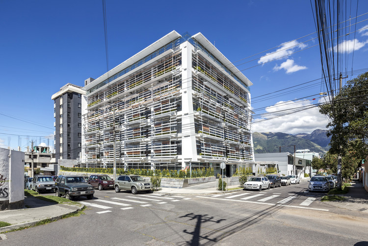
Text description provided by the architects. The Quito Publishing House is located in La Floresta neighborhood: a bohemian, artsy and closely knit community in the heart of Northern Quito. Its idiosyncratic nature posed the greatest design challenge. We were asked to introduce an office building where few exist and in the midst of a community with a strong sense of civil awareness, adamant about preserving the spatial values of its neighborhood. The program we were assigned was exciting: three publishing companies, formerly housed in separate floors of a high-rise, wanted to share one large space. Their employees are creative individuals with a strong aesthetic sensibility. This tripartite ownership of the building gave us more flexibility in terms of how we could program and distribute the space; all companies could relate within a similar hierarchal level. All three revolve around a central void, share the privilege of the same views, and have access to a roof garden. They also share communal spaces and we expect the fluid arrangement of the plan and section to catalyze a community atmosphere analogous to the one that characterizes the neighborhood.
From a formal standpoint, the great Modern domestic architecture of the surroundings inspired many of the elements that compose the building. In some of the houses of La Floresta, architecture and nature intertwine. Walking through its streets, one discovers a hidden garden beneath a staircase, or a staircase floating effortlessly above a pond, or a spatial procession that leads to the front door of a house. There are layers upon layers to be unveiled at La Floresta. We chose to emulate the mix of Modernity and nature; to create a spatial sequence that leads the users into the building and its roof garden; to open a central void or “hanging garden” that serves as a chimney and reinterprets the colonial courtyard, which besides capturing the zenithal light of Quito provides a visual cross section. The work spaces are wrapped by a double skin, the outer portion of which is a louvered screen, partially colored. Works of art punctuate the shared spaces, which act as galleries. The slope of the site is dealt with in the traditional Quito-way: through the integration of a zócalo, built in concrete and clad in black stone.
The Quito Publishing House received the first Leed Gold attributed to a building in continental Ecuador, for its intent of applying environmental design principles to a corporate building in the tropics.
Energy, Air and Light
The building is conceived of as a bioclimatic machinery, whose performance reduces to a minimum the dependence on mechanical systems of ventilation, heating and cooling. Since there are no elements projecting shadow upon the building, the northeastern and southeastern facades are subject to considerable solar exposure, particularly direct in the mornings. The “curtain” which would allow to regulate solar incidence was transferred from the interior of the building to the exterior, as a filter, understood as a biological wall, whose skin is interactive and capable of responding to temperature and humidity variations. The orange louvers respond to a climatic simulation that was more affordable than the introduction of sensors in each louver of the filters; flows of air ultimately depend on human manipulation, the most cost efficient option to reduce energy consumption. The fin shape of the louvers is aerodynamic so as to refract light and stimulate the generation of vortexes that accelerate the transfer of air. Its figure coincides, in section, with the operable windows. The central patio acts as a chimney that sucks the air towards the upper sections of the building and also serves as a funnel of zenithal light brought into the core of the building at the lower levels. This mechanism also injects air into the parking located underground. A vegetation layer shares with maintenance shelves the intersticial spaces located between skins (glass and louvers), providing an additional filter to purify and scent the air, buffer air flows and provide shade. The back façade provides enough thermal mass to absorb and liberate energy. The water surface in the ground floor, besides being a cooling device, responds to the need of rendering air circulation visible: it serves as a meter of the building´s performance through the rippling of the water surface. These mechanisms were introduced in order to take the greatest advantage of natural resources such as light and air, and in order to reduce to a minimum the consumption of energy and water.
Water
The building has an integrated system of rain water collection that is channeled towards the bathrooms and the garden roofs or vertical gardens, where it is used for irrigation purposes. A double piping system facilitates trickle irrigation along the gardened facades and reduces water consumption.
Landscaping
The vertical gardens act as another layer of thermal insulation within the chamber of the perimeter, just as the roof gardens above. Native Andean species were chosen for the gardening –most consume low portions of water.
Flexibility and adaptation
The sustainability of a building is proportional to its ability to adapt to different uses throughout time. The plans of QPH are open and lodge accessible electric, mechanical, lighting and communication installations to facilitate technological up-grades and maintenance.
Construction System and Technological Development
QPH was built with a system of pre-fabricated, partially animated components that demanded a close collaboration between design and the local industry.
Maintenance
The maintenance shelves introduced along the perimeter of the building serve as dust buffers, support for the pots, gardening area, and introduce corridors that facilitate cleaning windows and louvers.
Waste Management
The building incorporates the elements that are necessary to sort, collect and compact waste.
Transport
In order to support the cycling culture of La Floresta neigborhood, QPH provides bicycle racks, showers and lockers. The location of the building was selected taking into account is articulation to the public transportation system.
City
QPH recedes at the ground level in order to provide a secure public space that may contribute to activate surrounding urban tissues.